PROCESS
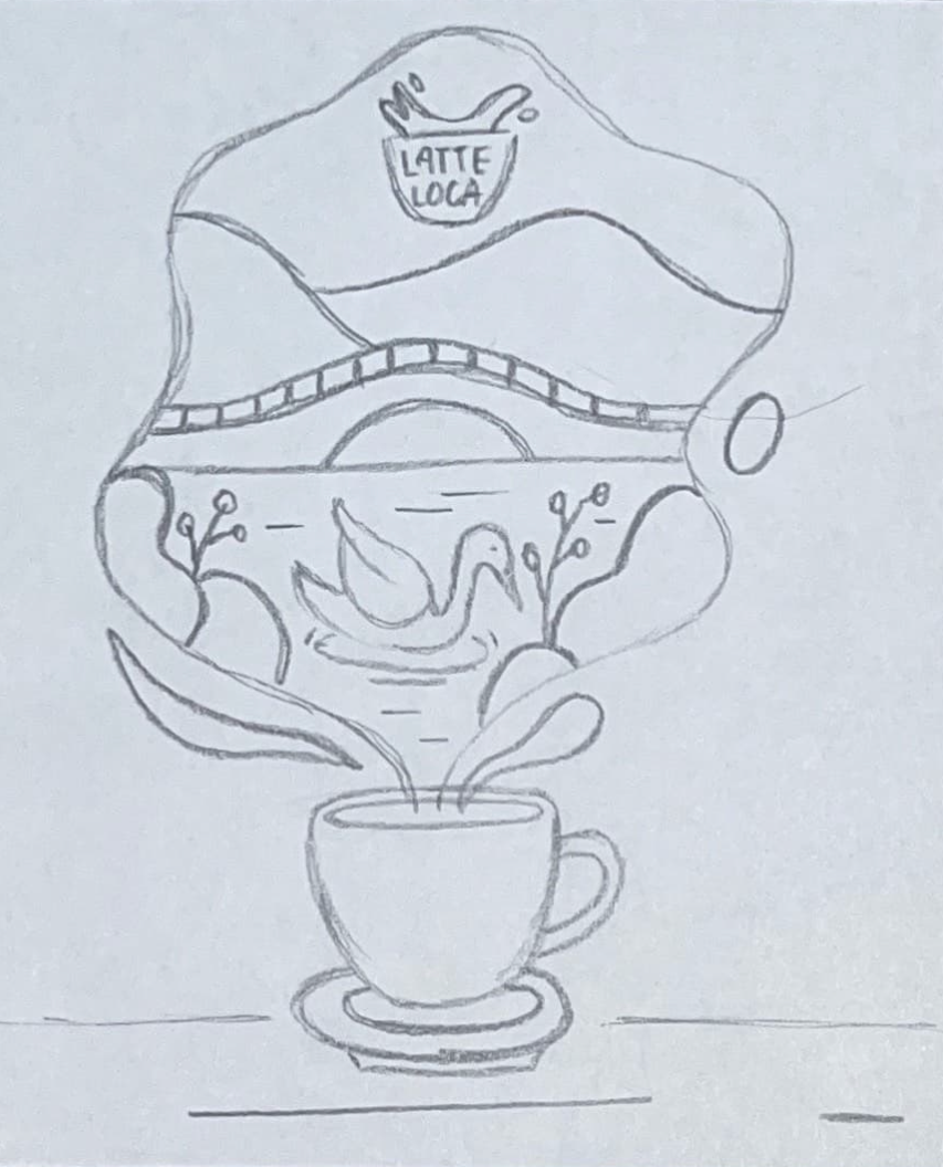
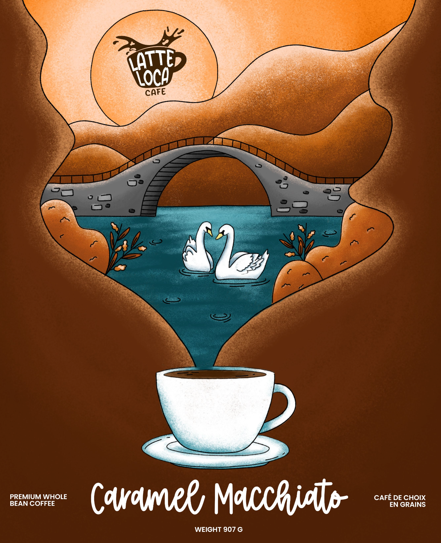
To start this project, I crafted the café's logo. I explored various designs and typography options that harmonized well with the company's name. Moving on to the illustration of the bag, I delved into researching Stratford, Ontario, extracting elements relevant to the city. Subsequently, I sketched out the design, ensuring it captured the essence of both the company and the city. Once the concept was finalized, I proceeded to outline and paint, employing a pastel texture. Opting for brown and autumn tones, I aimed to evoke a connection to the city's ambiance and the coffee's flavour profile.
Throughout the project, I utilized my iPad, along with Adobe Illustrator and Adobe Photoshop, to bring the designs to life.


