Process
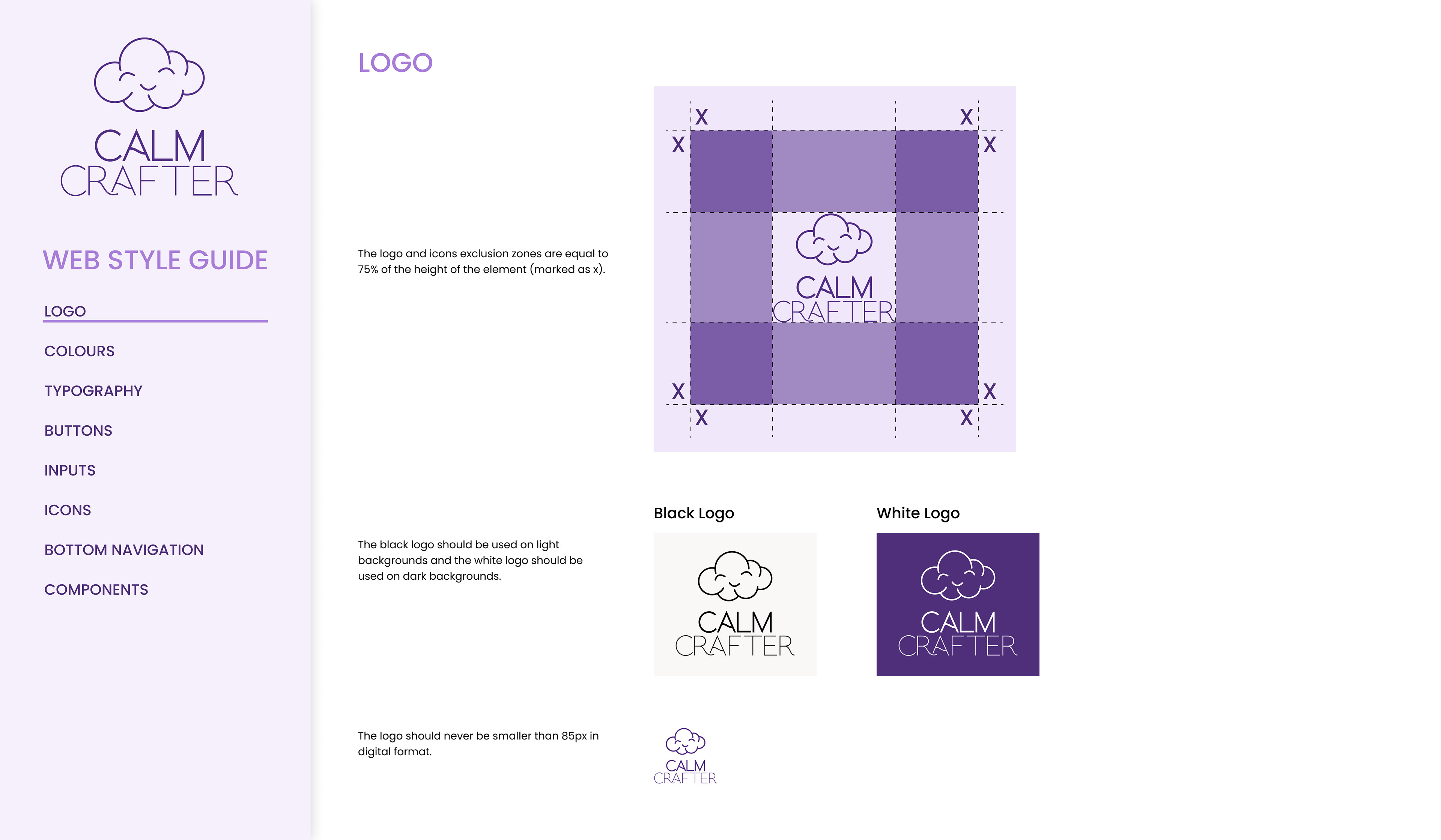
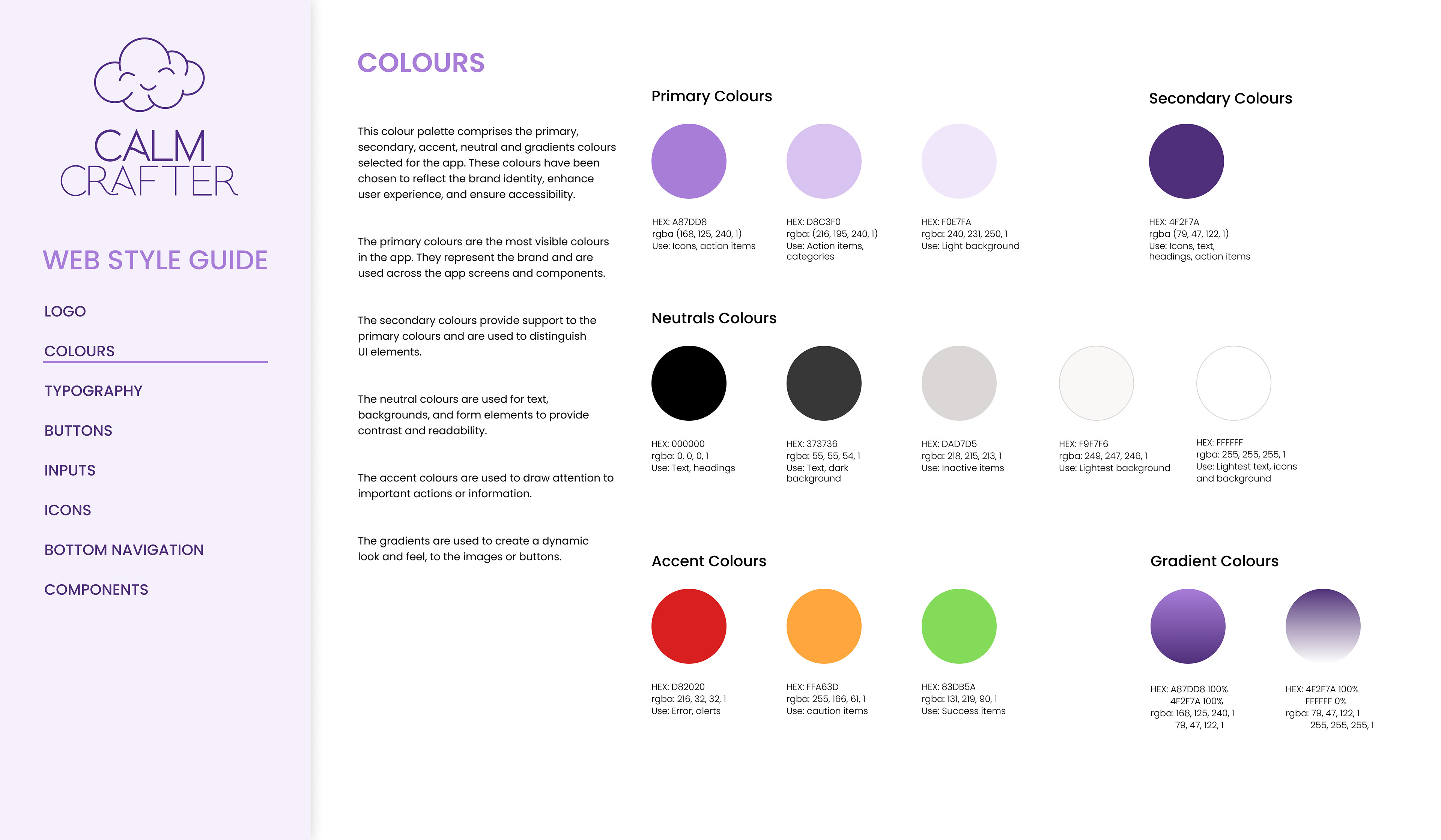
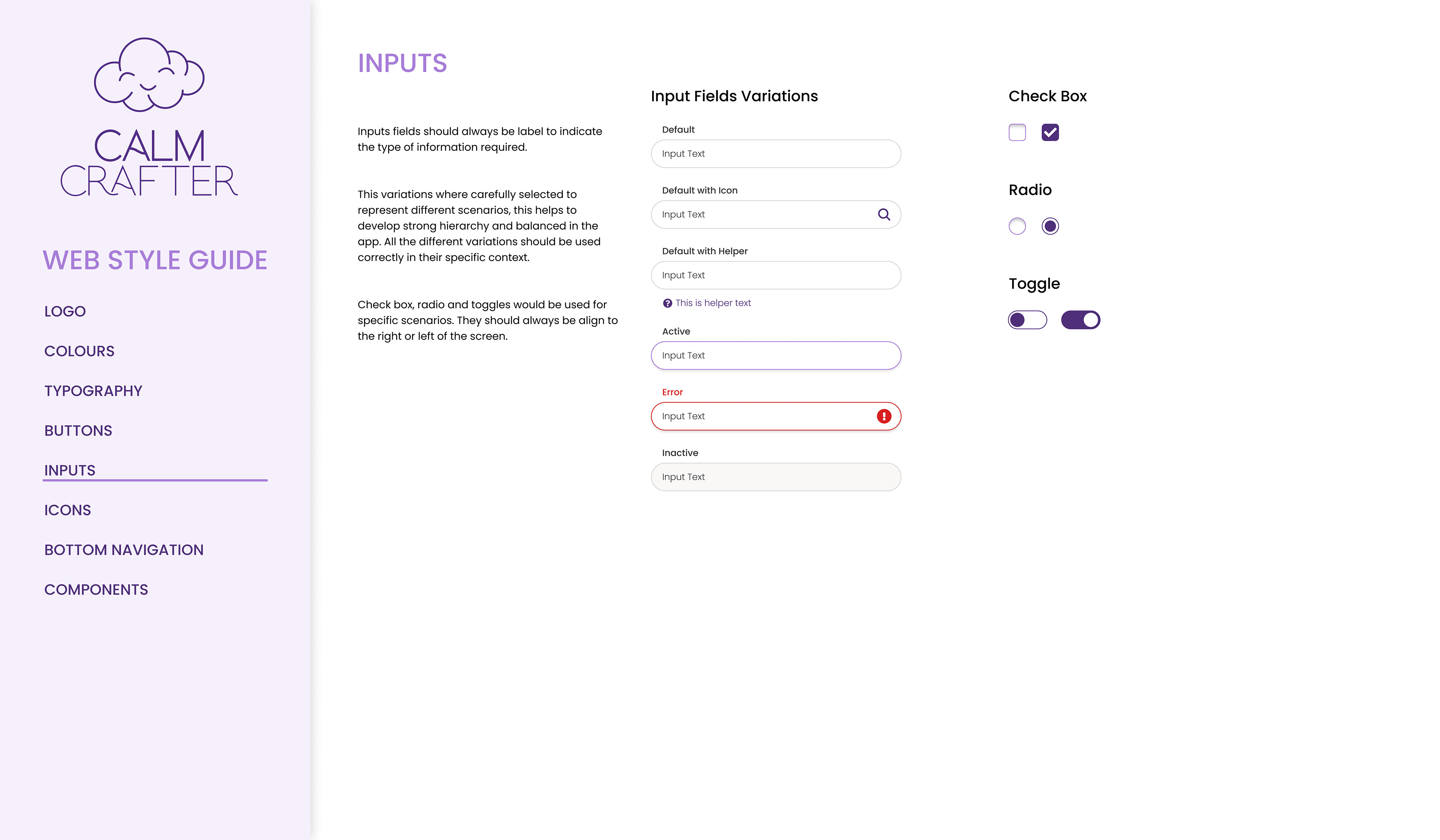
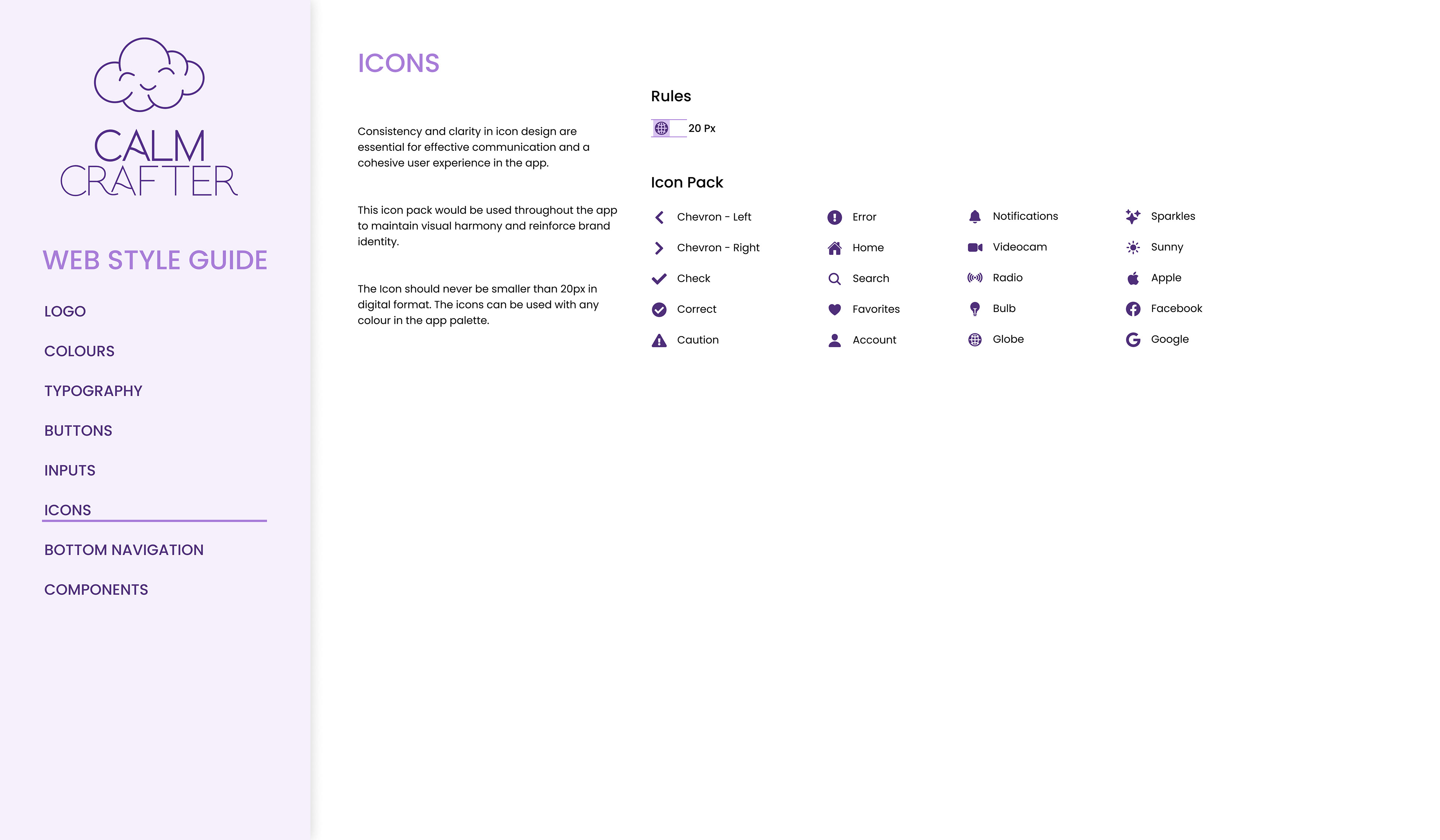
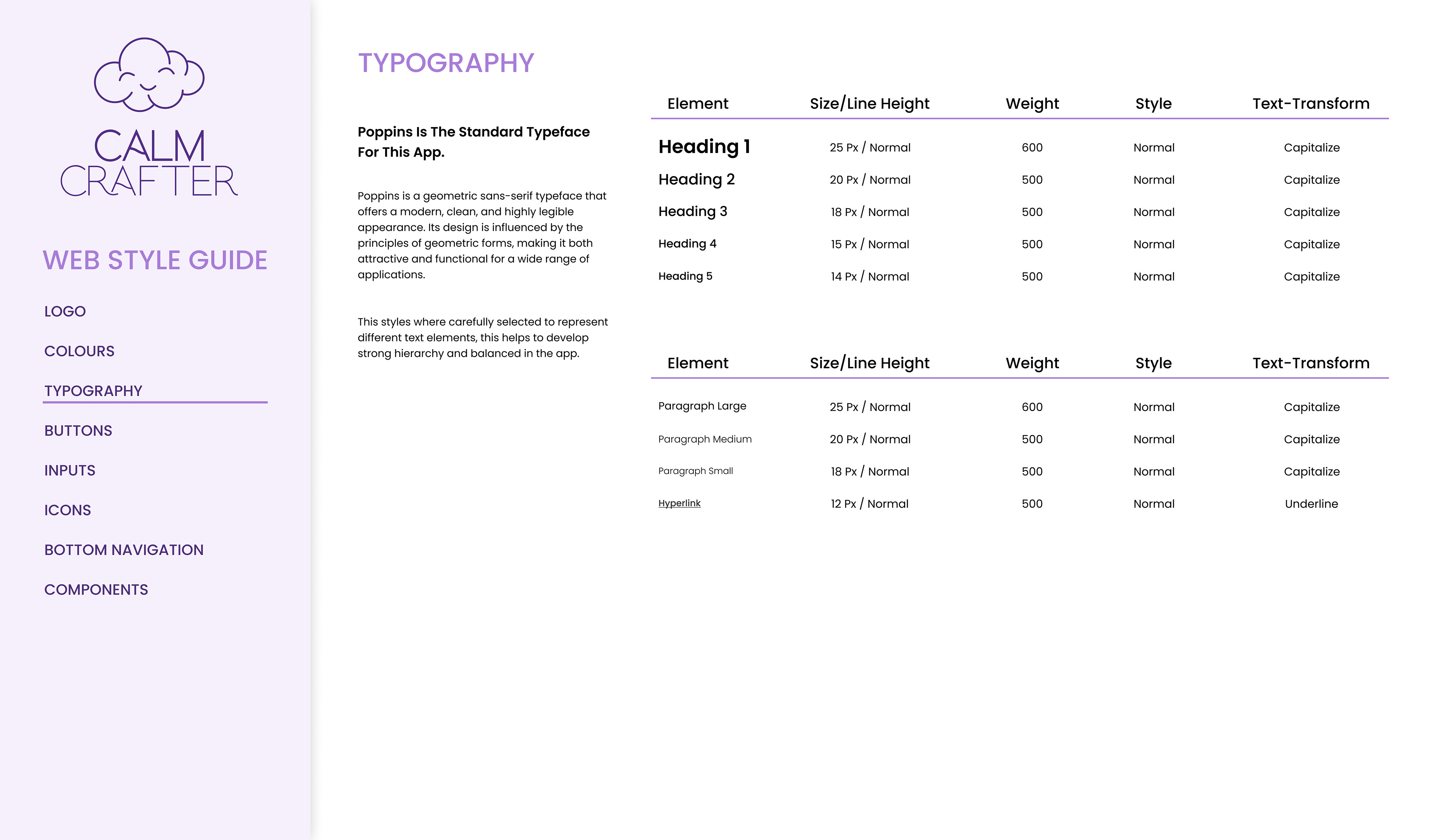
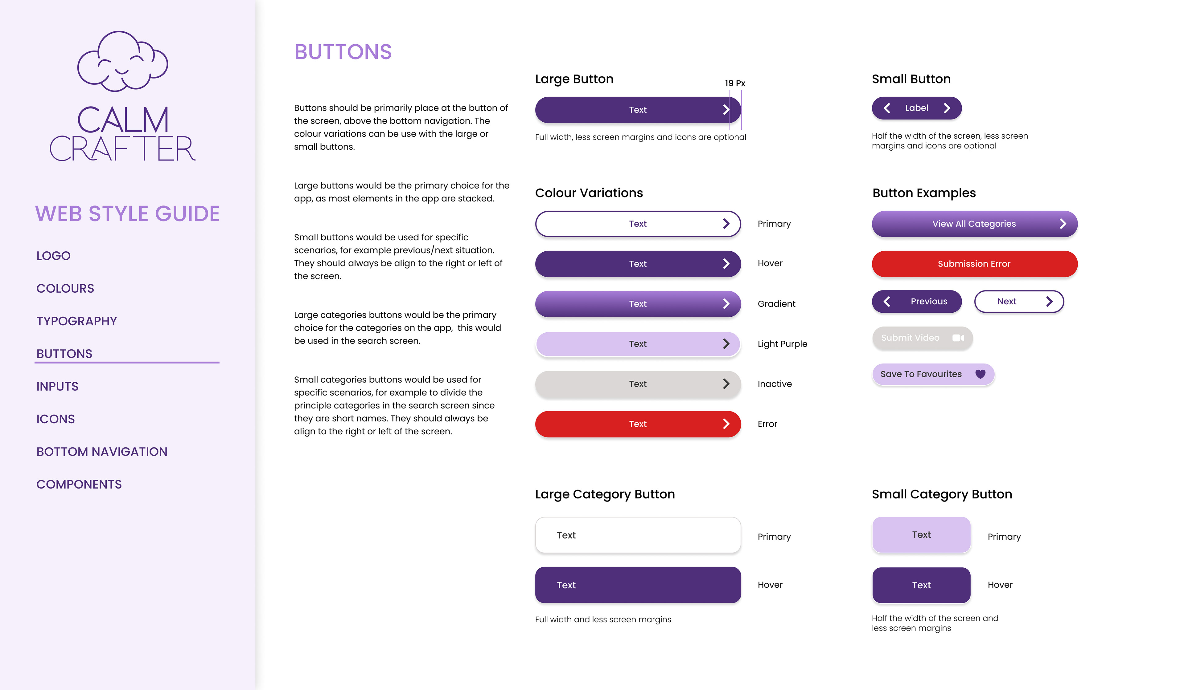
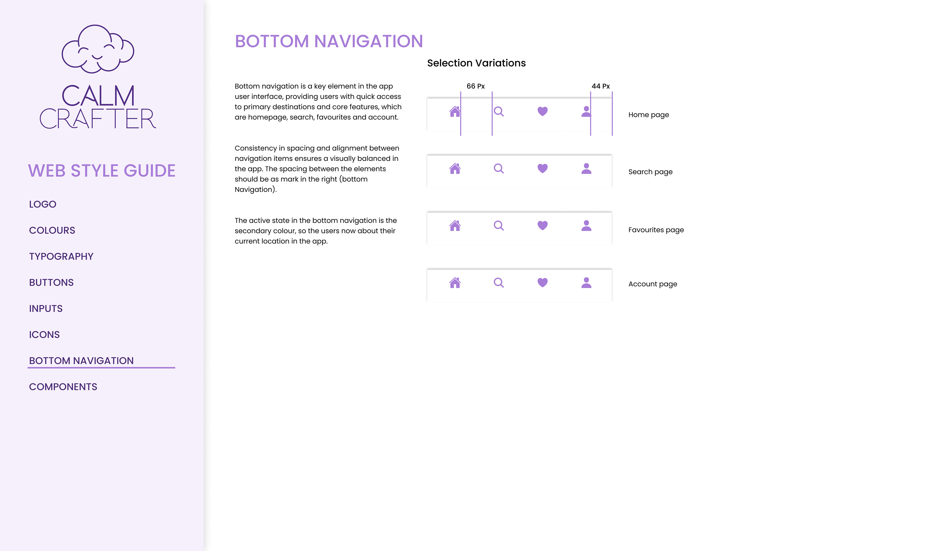
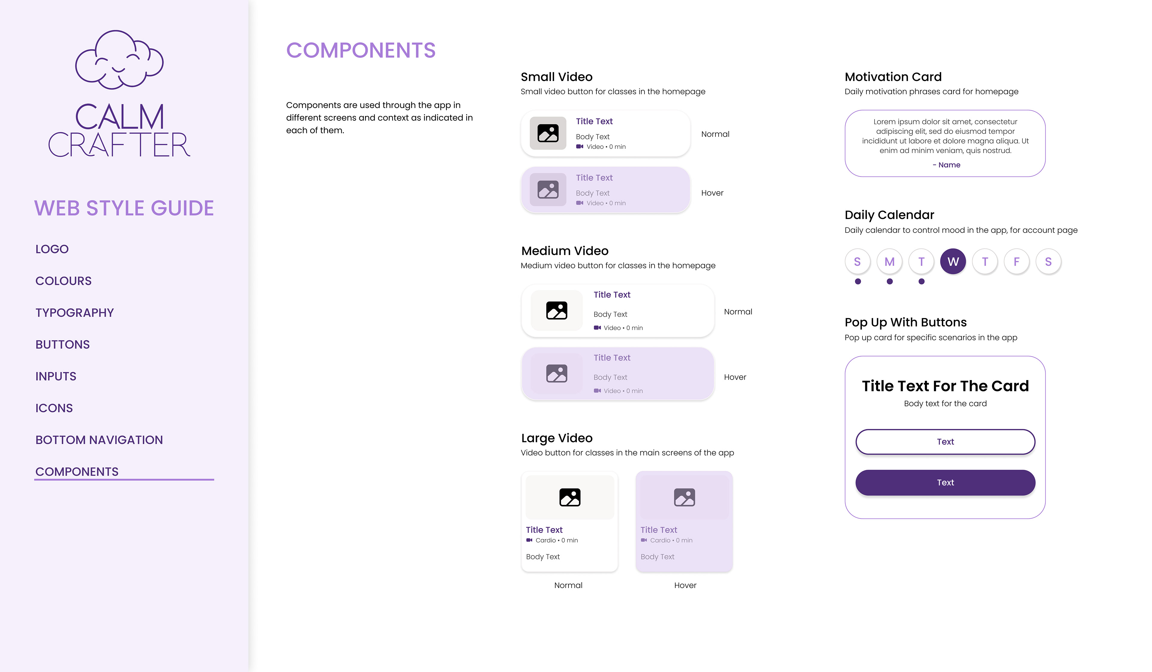
To start this project, I delved into researching the app's content and explored the psychology of colors to craft the logo. Opting for purple, a hue symbolizing both calmness and energy, seemed fitting. Throughout the development process, I prioritized simplicity, intuitiveness, and accessibility, ensuring the app was user-friendly for all. Additionally, I did extensive research guided the design, with adaptations made to suit the content of each screen.
Throughout this project, I utilized my Figma to execute the design.
